writing — Jul 19, 2026 · 8 min read
The Story Behind The Squares
The meaning of and process behind the creation of my logo
part of Logo
The Concept
I want to portray the experience of existing in "liminal space", not fitting into pre-existing boundaries, and having a unique "flavor".
When I say "liminal space", I'm not talking about horror games like The Backrooms. I'm talking about the threshold between worlds. I came to Japan without understanding language or culture. I deliberately chose liberal arts because no single path felt like my path.
I experience a unique blend of multiple cultures and worldviews in any given moment, and most people do not understand what that's like. I don't feel ostracized or excluded, but I don't feel like I fit into any single category either. I've realized that this isn't a character flaw or a shortcoming, but rather my own identity. Liminality is the essence of my existence.
The Constraints
This logo was originally done as a project in my Visual Communication Design course. The assignment was to make your own personal logo, not a company logo.
The logo needed to be:
- Scalable: What happens if your logo needs to be really tiny?
- Simple: Less is more. Don't overcomplicate it.
- Authentic: What is your identity? What do you want people to know about you?
Why The Squares?
Liminality
The logo is meant to portray the experience of existing in "liminal space". In liminal space there are a few patterns that make a space "liminal":
- Transitional/In-between: Liminal spaces are usually passages from one place to the next, like a hallway or a train station platform. You weren't meant to linger here, it's supposed to be the loading screen between the past and the future.
- Repetitive: In liminal space imagery, you don't see a lot of different elements, but rather a repetition of specific elements. Maybe it's lockers in a school hallway that all look the same, or the same door that repeats infinitely in a hotel corridor.
- Something is not quite normal: Something doesn't seem normal when you look at it. Maybe the place looks suspended in time, or like it's existing outside of its intended purpose. This could be an abandoned mall that looks like it hasn't been renovated since the 80s, or a school hallway while class is in session.
So Why The Grid?
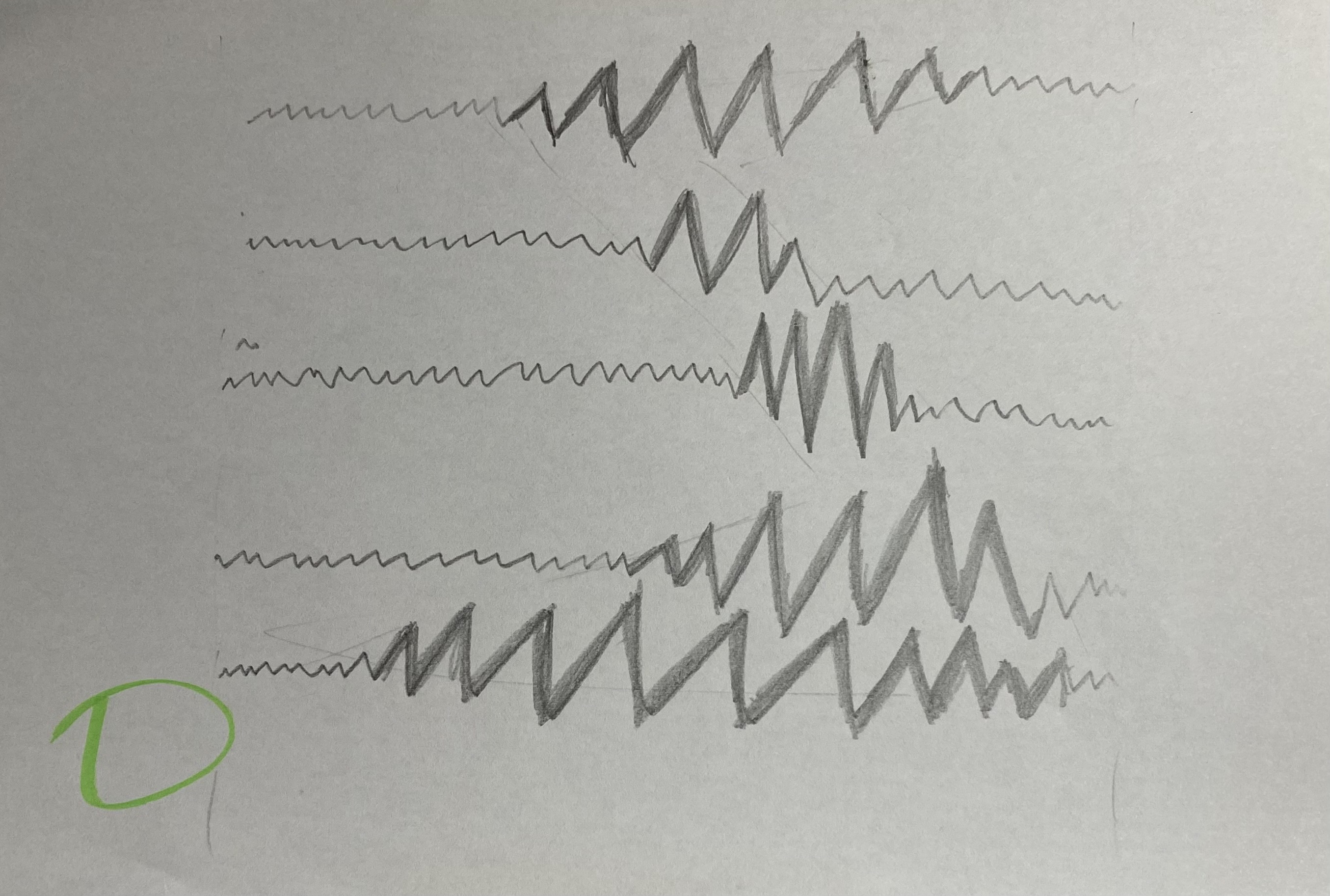
When I was making concept sketches, I was obsessing over lines intersecting. I thought that lines intersecting would be the way to describe liminality. However, nothing I did seemed right at all. I kept making sketches, but they all looked the same with slight variations.
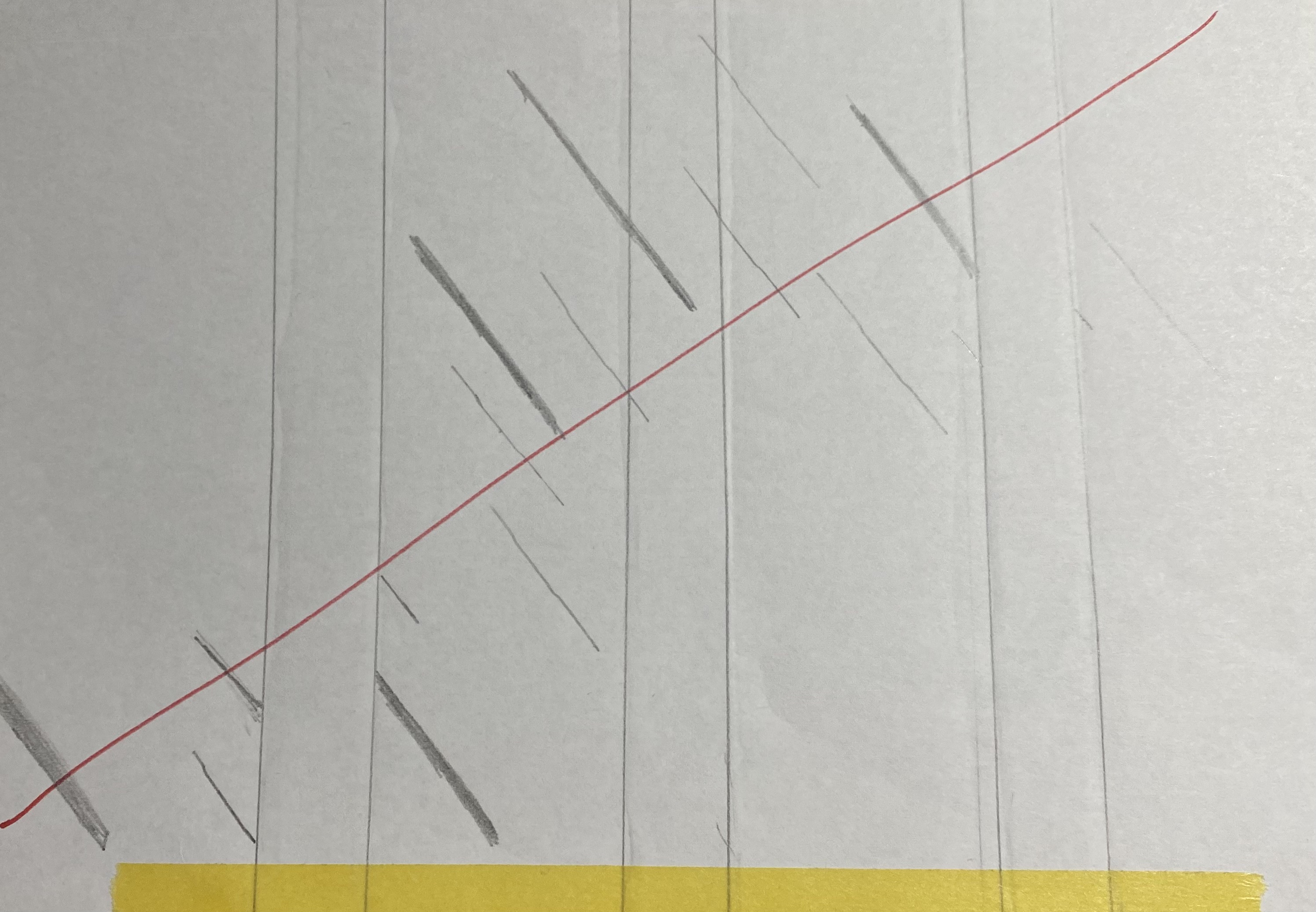
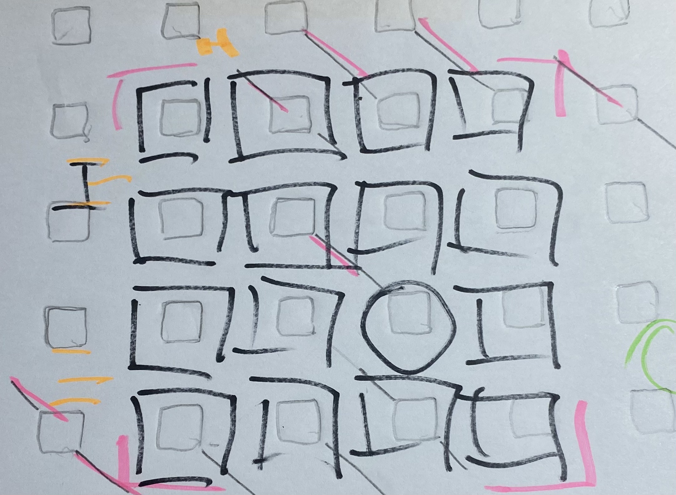
Out of frustration, I put my pen down and stared at the ceiling. This was when I had an idea. I immediately stood up on my chair and proceeded to trace the ceiling onto my paper. This was where I got the grid.
Unique Flavor
I have the grid, now what? My brain was still stuck on the lines. For some reason it couldn't let them go. I ended up drawing lines through the squares to form an S from a distance. I looked at the result and my confidence took a nose dive in the shallow end of the pool.
I took my new sketch along with the others and got feedback from my professor. They got mixed reactions, but the one with the squares was marked as a possibility. However, I had to let go of the lines. The lines just weren't working in my favor.
I also made the grid 5x5, 4x4, and finally 3x3 to give more simplicity to the design. I still had the issue of what else to do. I have to exist somewhere in this logo. At first, I decided to just make a circle or an oval to contrast the squares. However, this wasn't "the sauce". There was nothing interesting or special about a normal circle or oval.
This was the bottleneck of the logo. I needed something that had this "unique flavor", that represented my experience of existing in between worlds. The shape had to be different, not perfect, and reach outside of the boundaries of the other squares.
I got different advice on the shape, ranging from a teardrop to a weird shaped bean. I tried all of them, and nothing looked right. I was rather persistent asking for feedback and advice on my iterations, but I had to get the input. I was banging my head on a wall in another dimension trying to get the right shape. This was when I realized that I was attempting to outsource meaning, and needed to make my own shapes. The beans are officially out!
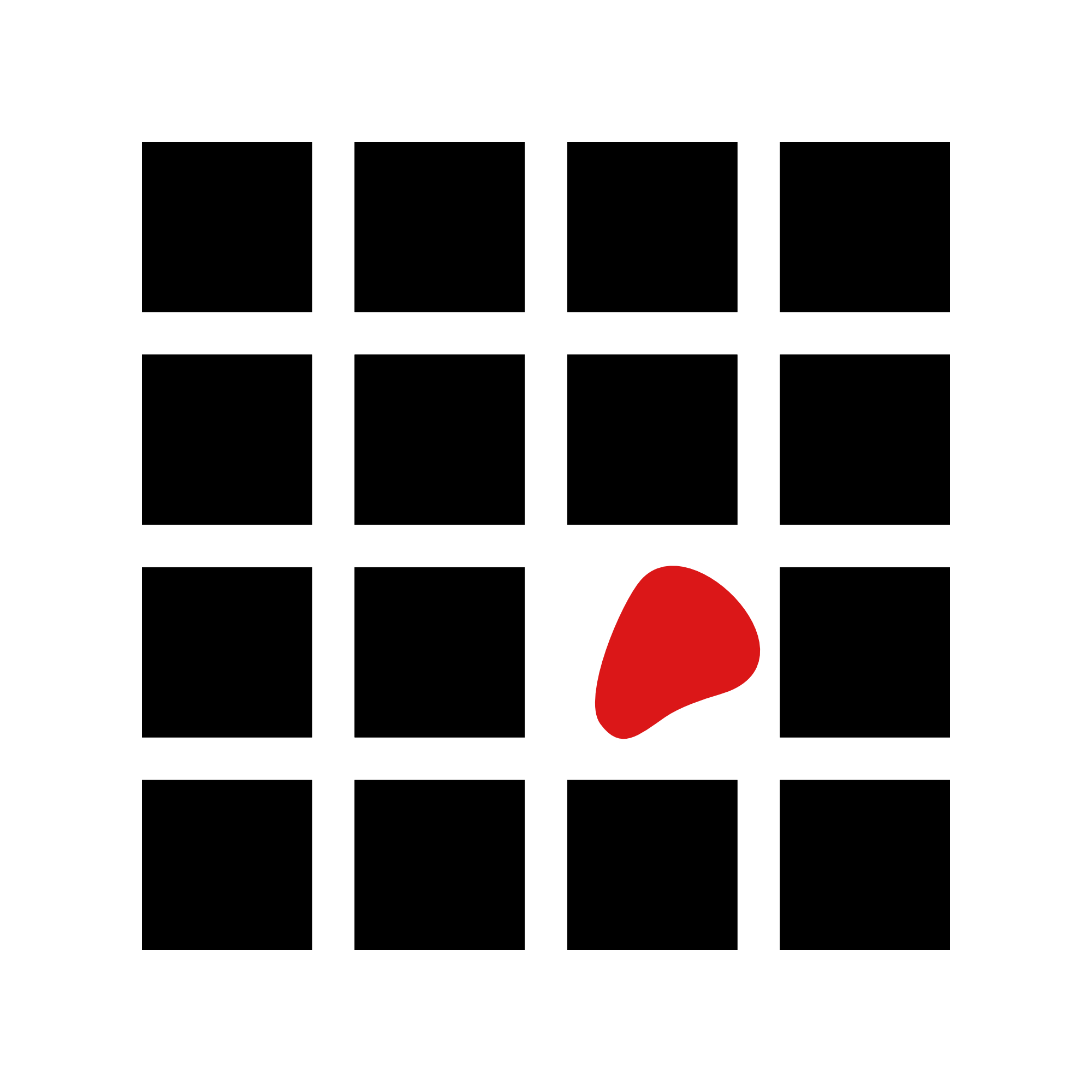
After many failed attempts at something I liked, I happened to make a crescent shape out of a non-perfect circle. I kept tweaking the corners and the size little by little until I had it. This was the one.

Why the Void?
This was also a decision after many failed attempts to make a color scheme I liked. I originally wanted a red and black design for contrast. However I ditched this color scheme for 3 reasons:
- There's nothing really interesting about the logo when it's black and red. It looks like a million other things that already exist.
- It looks like blood in a crime scene.
- It doesn't really represent my identity.

Blue and Orange
I started to experiment with different colors, especially contrasting colors. I looked at complementary colors for the logo, but the one that stood out to me the most was the orange-blue combo.
Orange is a good middle-ground between red and yellow. It has the passion and energy of red, accompanied by the creativity and optimism of yellow. You get a unique blend of enthusiasm and warmth. Orange was the perfect choice for the "unique flavor".
Looking at the complementary color for orange, I initially landed on a light blue. I didn't feel like the light blue was doing me any favors, and immediately looked for alternatives. I looked at different shades of blue, and found that I preferred darker shades of blue.
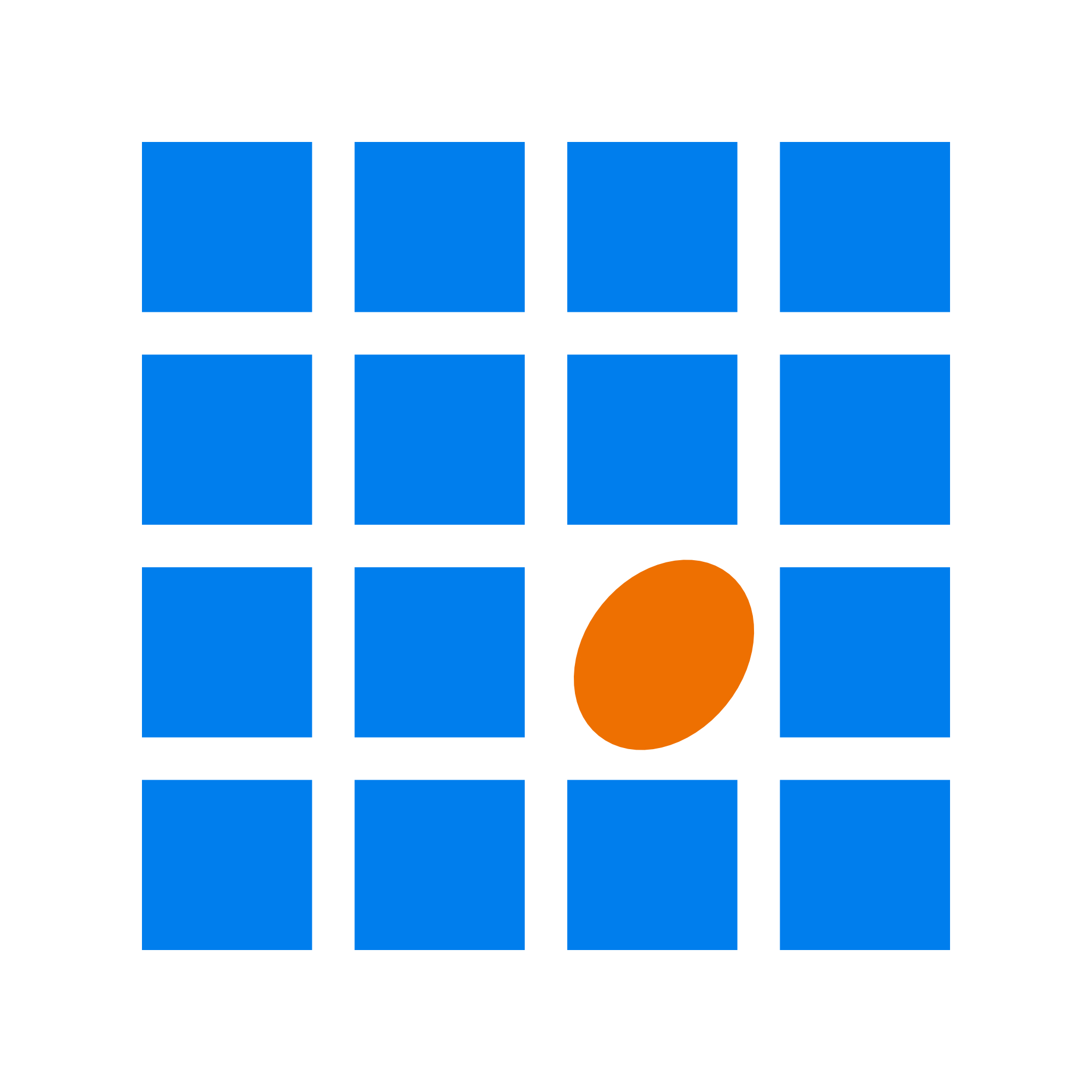
I tried the same thing, but with a slightly darker shade of blue and a lighter shade of orange. The results looked... like a hardware store anywhere in the world.

I kept on iterating, breaking the assumption that the colors had to be complementary or had to be light and dark versions. I was then left with the one. The blue and the orange work together to convey the message that I wanted to. I exist among multiple worlds that each have their own set of norms and values. I can interact with all of them, but I retain my own unique identity in the process.

Why Does This Logo Work?
Scalability and Simplicity This logo can be scaled without becoming unreadable. It kept the essential elements without overcomplicating the logo. The shift from a 5x5 grid to a 3x3 grid and the use of basic geometry achieved both of these things for the logo.
The bean wasn't the best solution in the end not just because of taste, but also that it didn't satisfy these requirements. How small could you go and still recognize the bean? How easy is the bean to recreate? Spoiler, it's actually not that easy to recreate.
Authenticity The grid creates a repetitive field, where the expectation is that all the shapes will fit neatly inside the grid. The crescent breaks your expectations. It's not another square, and it doesn't fit within the pre-defined range that the squares created. It says "un-contained" and "liminal" without even using the words.
The blue creates a calm terrain of pre-defined categories. They aren't inherently bad, they are existing categories that exist in their own worlds. The orange creates a unique energetic burst that breaks up the pre-defined world. It makes the statement that I don't exist within pre-defined categories, and I'm not contained within anything.
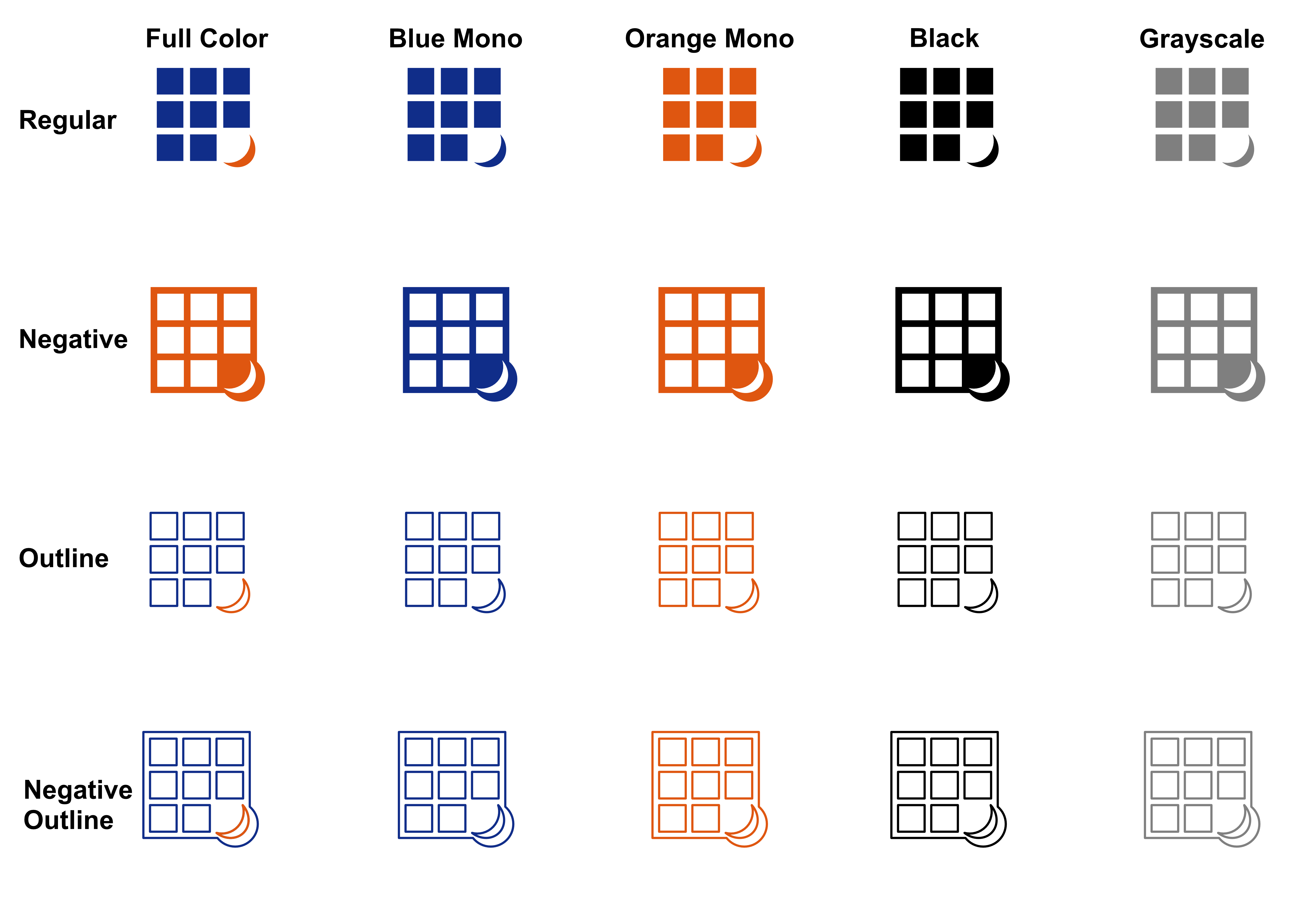
Final Result
What to Take From This
Your personal brand will likely be very different from mine. Your creative process will likely look very different as well. However, I think there are still some things to walk away with:
- If you need inspiration, just touch grass, or the ceiling ;)
- Gather feedback aggressively, but you can't outsource meaning